HW5_visualization_and_eda
Homework Assignment #5 : Visualization and EDA
import pandas as pd
import numpy as np
import matplotlib.pyplot as plt
import seaborn as sns

%matplotlib inline
From the given data (covid20200416_rev.csv), write your codes according to the following questions.
df_covid = pd.read_csv('./covid20200416_rev.csv')
print(len(df_covid))
df_covid.head()
` 212 `
| country | total_cases | total_deaths | total_recovered | Tot_cases_per_1Mpop | Deaths_per_1Mpop | region | |
|---|---|---|---|---|---|---|---|
| 0 | USA | 644089 | 28529 | 48701 | 1946.0 | 86.0 | North America |
| 1 | Spain | 180659 | 18812 | 70853 | 3864.0 | 402.0 | Europe |
| 2 | Italy | 165155 | 21645 | 38092 | 2732.0 | 358.0 | Europe |
| 3 | France | 147863 | 17167 | 30955 | 2265.0 | 263.0 | Europe |
| 4 | Germany | 134753 | 3804 | 72600 | 1608.0 | 45.0 | Europe |
df_covid.describe()
| total_cases | total_deaths | total_recovered | Tot_cases_per_1Mpop | Deaths_per_1Mpop | |
|---|---|---|---|---|---|
| count | 212.000000 | 212.000000 | 212.000000 | 210.000000 | 162.000000 |
| mean | 9826.905660 | 634.976415 | 2407.268868 | 626.120143 | 33.438457 |
| std | 50052.898899 | 3155.560189 | 10488.024252 | 1463.639958 | 107.465073 |
| min | 1.000000 | 0.000000 | 0.000000 | 0.030000 | 0.030000 |
| 25% | 39.500000 | 1.000000 | 5.000000 | 18.000000 | 0.600000 |
| 50% | 382.500000 | 6.000000 | 67.000000 | 104.500000 | 3.000000 |
| 75% | 2270.250000 | 52.750000 | 346.250000 | 465.750000 | 17.000000 |
| max | 644089.000000 | 28529.000000 | 77892.000000 | 11582.000000 | 1061.000000 |
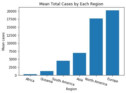
(1) Visualize the mean total_cases according to each region by the bar chart.
# your code here
mean_total_cases_by_region = df_covid.groupby('region').total_cases.mean()
mean_total_cases_by_region
mean_total_cases_by_region.sort_values(inplace=True, ascending=True)
x = mean_total_cases_by_region.index.tolist()
y = mean_total_cases_by_region.values.tolist()
# x1 = list(mean_total_cases_by_region.index)
# y1 = list(mean_total_cases_by_region.values)
#print(type(x), y, type(x1), y1)

plt.title('Mean Total Cases by Each Region')
plt.xlabel("Region")
plt.ylabel("Mean cases")
#plt.barh(x,y)
plt.bar(x,y)
plt.xticks(rotation=-15)
plt.show()
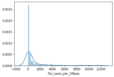
(2) Plot the distribution(histogram) of total cases per 1M population (Tot_cases_per_1Mpop) using Seaborn package.
- Note: Before applying the visualization for distribution, you may need to filter out rows of missing value (NaN).
# your code here 2-1 : find NaN
print("duplicated data?:", df_covid.duplicated().sum())
sns.heatmap(df_covid.isnull(), cbar=False)
plt.show()
` duplicated data?: 0 `
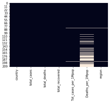
# your code here 2-2 :dropna
df_covid = df_covid.dropna(subset=['Tot_cases_per_1Mpop'], axis = 'index')

d = df_covid.Tot_cases_per_1Mpop.isnull()
# len(d)
count = 0 ;
for i in range(0, len(d)):
    if d.iloc[i] == True:
        count += 1
print("NaN of 'Tot_cases_per_1Mpop':", count)

sns.heatmap(df_covid.isnull(), cbar=False)
plt.show()
` NaN of ‘Tot_cases_per_1Mpop’: 0 `

# your code here 2-3 : draw plot
sns.distplot(df_covid['Tot_cases_per_1Mpop'])
plt.show()
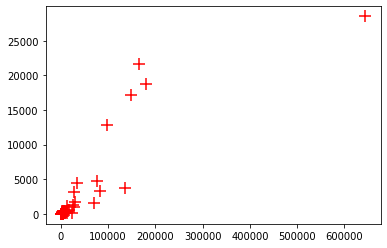
(3) Plot the scatter plot according to the following conditions
- x values: ‘total_cases’
- y values: ‘total_deaths’
# your code here 3-1 : describe dataframe
df_covid.describe()
| total_cases | total_deaths | total_recovered | Tot_cases_per_1Mpop | Deaths_per_1Mpop | |
|---|---|---|---|---|---|
| count | 210.000000 | 210.000000 | 210.000000 | 210.000000 | 162.000000 |
| mean | 9917.061905 | 640.957143 | 2427.128571 | 626.120143 | 33.438457 |
| std | 50283.196920 | 3170.021744 | 10536.046314 | 1463.639958 | 107.465073 |
| min | 1.000000 | 0.000000 | 0.000000 | 0.030000 | 0.030000 |
| 25% | 41.500000 | 1.000000 | 5.250000 | 18.000000 | 0.600000 |
| 50% | 382.500000 | 6.000000 | 67.000000 | 104.500000 | 3.000000 |
| 75% | 2426.750000 | 58.250000 | 333.000000 | 465.750000 | 17.000000 |
| max | 644089.000000 | 28529.000000 | 77892.000000 | 11582.000000 | 1061.000000 |
# your code here 3-2 : draw plot

x = df_covid['total_cases']
y = df_covid['total_deaths']

plt.scatter(x, y, marker = '+', s=150, color='red')
plt.show()
(4) Plot the heatmap of correlations among all numerical variables. Which variable (column) is the most correlated with the value “total_cases”?
# your code here : 4-1 calculate corr
df_corr = df_covid[:]
df_corr.corr()
| total_cases | total_deaths | total_recovered | Tot_cases_per_1Mpop | Deaths_per_1Mpop | |
|---|---|---|---|---|---|
| total_cases | 1.000000 | 0.885806 | 0.652631 | 0.156965 | 0.220542 |
| total_deaths | 0.885806 | 1.000000 | 0.664417 | 0.209220 | 0.379455 |
| total_recovered | 0.652631 | 0.664417 | 1.000000 | 0.160642 | 0.244011 |
| Tot_cases_per_1Mpop | 0.156965 | 0.209220 | 0.160642 | 1.000000 | 0.852964 |
| Deaths_per_1Mpop | 0.220542 | 0.379455 | 0.244011 | 0.852964 | 1.000000 |
# your code here :4-2 draw heatmap
h = sns.heatmap(df_corr.corr(), annot=True, cmap='RdYlGn_r')
h.set_xticklabels(h.get_xticklabels(),rotation=-15, fontsize='small')
plt.show()

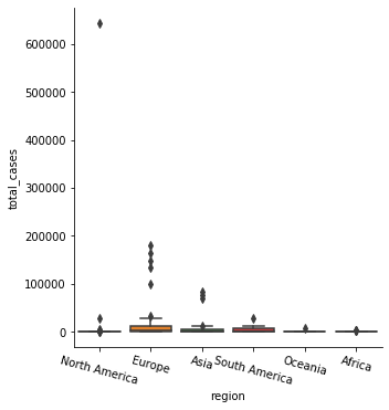
5) Plot the boxplots of mean total_cases according to each “region”.
# your code here
sns.catplot(x='region', y='total_cases', kind='box', data=df_covid)
plt.xticks(rotation = -15)
plt.show()
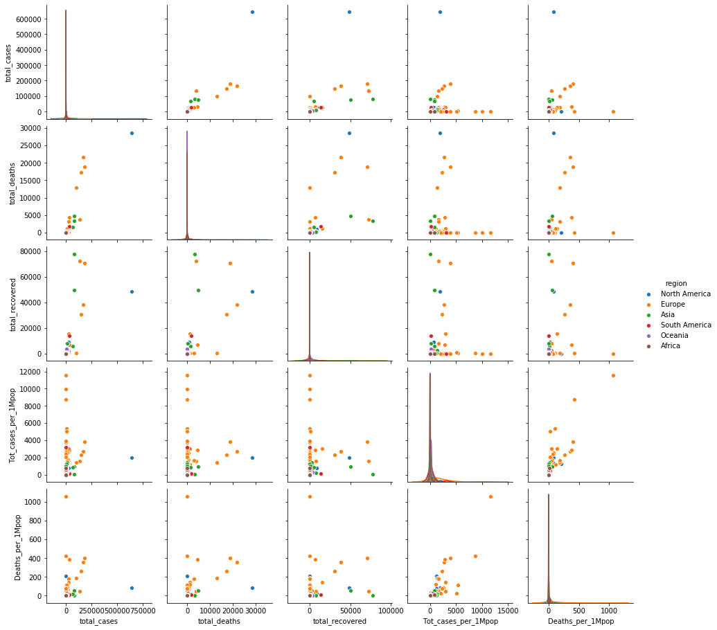
Open question: Can you find any other insight from the data?
#your code here : Open question-1
sns.pairplot(data=df_covid, hue='region')
plt.show()
#your code here : Open question-2
df_covid.sort_values(by='total_deaths', ascending=False)
| country | total_cases | total_deaths | total_recovered | Tot_cases_per_1Mpop | Deaths_per_1Mpop | region | |
|---|---|---|---|---|---|---|---|
| 0 | USA | 644089 | 28529 | 48701 | 1946.00 | 86.0 | North America |
| 2 | Italy | 165155 | 21645 | 38092 | 2732.00 | 358.0 | Europe |
| 1 | Spain | 180659 | 18812 | 70853 | 3864.00 | 402.0 | Europe |
| 3 | France | 147863 | 17167 | 30955 | 2265.00 | 263.0 | Europe |
| 5 | UK | 98476 | 12868 | 344 | 1451.00 | 190.0 | Europe |
| ... | ... | ... | ... | ... | ... | ... | ... |
| 175 | Nepal | 16 | 0 | 1 | 0.50 | NaN | Asia |
| 176 | Dominica | 16 | 0 | 8 | 222.00 | NaN | North America |
| 178 | Namibia | 16 | 0 | 3 | 6.00 | NaN | Africa |
| 179 | Saint Lucia | 15 | 0 | 11 | 82.00 | NaN | North America |
| 211 | Yemen | 1 | 0 | 0 | 0.03 | NaN | Asia |
210 rows × 7 columns
#your code here : Open question-3
df_covid.sort_values(by='total_recovered', ascending=False)
| country | total_cases | total_deaths | total_recovered | Tot_cases_per_1Mpop | Deaths_per_1Mpop | region | |
|---|---|---|---|---|---|---|---|
| 6 | China | 82341 | 3342 | 77892 | 57.00 | 2.0 | Asia |
| 4 | Germany | 134753 | 3804 | 72600 | 1608.00 | 45.0 | Europe |
| 1 | Spain | 180659 | 18812 | 70853 | 3864.00 | 402.0 | Europe |
| 7 | Iran | 76389 | 4777 | 49933 | 909.00 | 57.0 | Asia |
| 0 | USA | 644089 | 28529 | 48701 | 1946.00 | 86.0 | North America |
| ... | ... | ... | ... | ... | ... | ... | ... |
| 172 | Belize | 18 | 2 | 0 | 45.00 | 5.0 | North America |
| 158 | Haiti | 41 | 3 | 0 | 4.00 | 0.3 | North America |
| 157 | Guinea-Bissau | 43 | 0 | 0 | 22.00 | NaN | Africa |
| 149 | French Polynesia | 55 | 0 | 0 | 196.00 | NaN | Oceania |
| 211 | Yemen | 1 | 0 | 0 | 0.03 | NaN | Asia |
210 rows × 7 columns
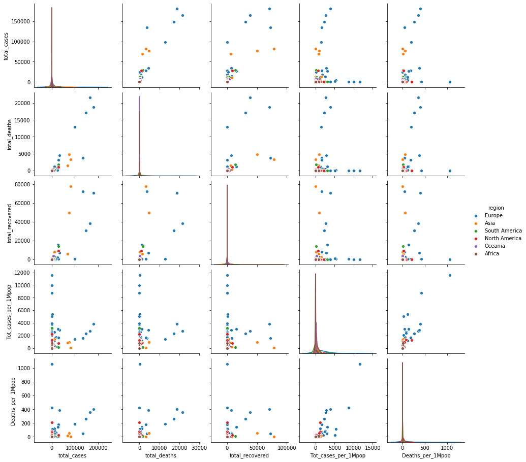
#your code here : Open question-4
df_covid_no_usa = df_covid.drop(df_covid[df_covid['country'] == 'USA'].index)
sns.pairplot(data=df_covid_no_usa, hue='region')
plt.show()
`
결론
- North America(미국) 이 다른 나라에 비해 월등하게 높은 감염이 일어나고 있다.
- 미국 케이스를 제외하면 total cases 기준 유럽국가들의 사망률(특히 이탈리아)이 높다.
- 아시아 국가들(중국, 이란)이 동일 감염case에 대해 recover 되는 확률이 높은 편이다 `
Leave a comment